Using Dark Paint Colours – Dark Art

admin
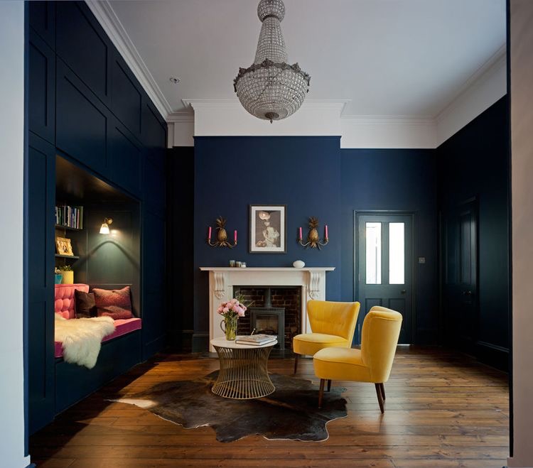
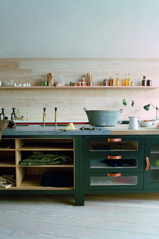
The trend for painting rooms in darker shades is really taking hold, with the likes of Abigail Ahern and Rockett St George taking this look into the main stream. Even M&S’s latest press show showcased a F+B Hague Blue set! Deeper shades have traditionally been seen as a bold move, but they can be used…

London lawns – Real or No Real?

admin

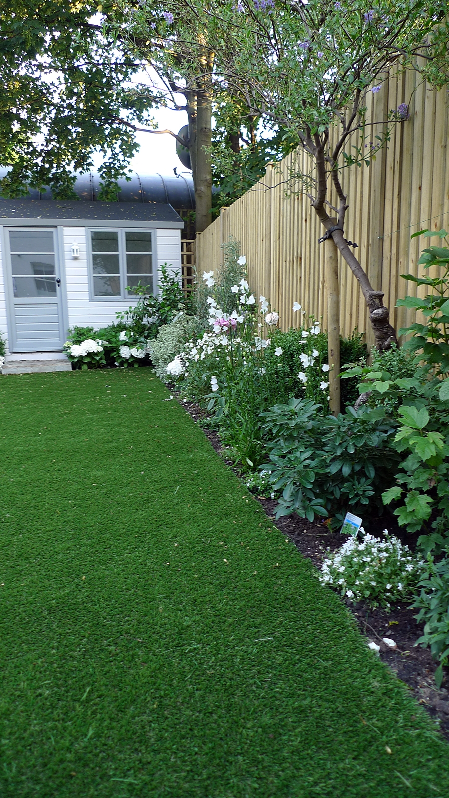
Ok, I’ll admit it. I’ve just had an artificial face lift. Or at least the lawn has. After six months watching our brand new lawn turn from lush green to boggy brown, our only option was to go artificial. My eco conscience had to be talked down as there was really no other way to provide a safe and practical year round space for three kids plus dog.

Obviously I wanted the new lawn to not only perform well but look as authentic as possible. There are a large number of firms on the market, capitalising on the growing trend for artificial grass and they by and large offer similar products. The standard has improved tremendously over the last few years with exciting developments in fabrication, yarn shape and drainage, resulting in grass which not only looks more realistic but doesn’t flatten over time.

Although the finished product is undoubtedly rather neat compared to a real lawn, I am impressed by the result. Much of the imagery for artificial lawns shows them in very stark contemporary spaces. However, within a classic, more abundant setting they can look for a more natural. As our own garden has not long been planned, it still needs to soften and mature. As the second image from Pinterest shows, this really helps the lawn integrate into the scheme.

The real win is that the kids are already playing out on it, even in the middle of winter. Oh, and the dog is just as happy to carry out his morning back scratching routine as he was in the muddy swamp. Success!

Work stations

admin
Acknowledgement artstyleonline.com

Around 15% of the population now work from home and the trend is growing, but not all of us have the luxury of a spare room to designate as an office.

Establishing an area to work from within the home is not easy, especially if you are utilising space within an existing room. If this is the case then often your work station will need to share the space with a bed, dining table or sofa. When we need rooms to have multiple functions, a home office is often the secondary use. As a result, not only do you need to create a space which really functions with a suitable desk, chair and lighting, but also the ability to zone off the space. Creating a clear divide between work and home life is paramount for both a tidy house and mind.

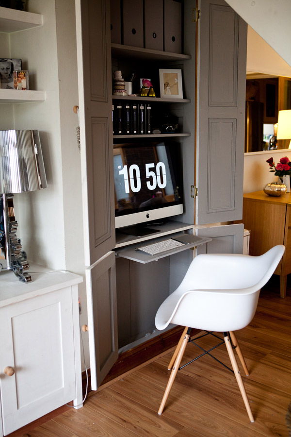
Firstly, think about this zoning of your space. This could be the corner of a room, demarked by a screen or furniture. In this case be sure to use furniture which is not only practical but also complements your room. Alternatively, you might consider utilising an alcove and screening with bespoke doors. If you are going for the built in route, then ensure that you consider electrics for lighting and power points. Whether built-in or freestanding, think about the light available in your chosen space. Try to maximise the amount of natural light, but beware of glare, especially on computer screens. Even in the lightest of spots, task lighting will be useful for certain jobs and times of day.

Once you have earmarked you space, think about the furniture you will require. A desk made to fit a space should not cost the earth. If buying off the shelf, then don’t do mad. Buy the biggest desk possible for the space and ensure it is deep enough for you computer / laptop. Printers and other equipment can always be sited on a trolley or shelf underneath. Use the money saved on the desk to buy the best chair you can afford. As any office manager, or chiropractor will tell you, it is imperative to sit correctly. You would not expect to sit on a kitchen chair or bar stool in an office so don’t do it at home. Ensure that when you sit upright with your feet flat on the floor your desk / chair combination are at the correct height. Your back will thank you later.

Once you’re ready to decorate, be sure to give the colour some careful thought. Muted shades of blue, yellow and green can all be calm and conducive to work. Bright colours like red and orange, or patterned wallpaper are probably best left to the other parts of the house.

In terms of storage, you can never have too much. Office suppliers can be used for functional filing but if you are sharing the space then be careful to choose options which complement the room. Modular shelving is flexible and efficient and always consider the space above the desk which can otherwise be wasted. Always try to have at least a couple of drawers for the inevitable pens, paperclips and assorted bits and bobs. The ability to have enough storage to keep all work related belongings tidy, is not just necessary for an orderly work life, but also to allow every trace of work to be shut away when the room is in its primary use.

Do not forget lighting and ensure you have sufficient task lighting for your job in hand. A desk lamp will often suffice but, if building a bespoke unit, think about using spots or LED strips to light up your work space.

For my home office, which is sat within our spare bedroom, I used traditional wooden furniure which tied in with the existing chest of drawers. We gave the room a masculine, gentlemen’s library feel with darker walls and leather chair so that a desk would not look out of place, but softened the scheme with an antique chandelier and botanical prints. The easy chair not only works as bedroom furniture, but is a useful addition to any home office, providing a comfortable spot to read or make phone calls. The vintage filing cabinet gives ample storage for all paperwork and is a beautiful piece of furniture in its own right. As I use a laptop, by having sufficient drawer space within the desk I’m able to keep the desktop free of clutter when we have guests staying.

I am still on the hunt for the perfect chair!

Acknowledgement florencefinds.com
Acknowledgement Elle Decoration via madaboutthehouse.com

The joy of kids. Part 1

admin

Having designed many adult spaces, turning my hand to designing for families has been a real eye opener. And now that I have three of my own, in addition to our dog, I am becoming more and more obsessed with the challenge of family friendly space.

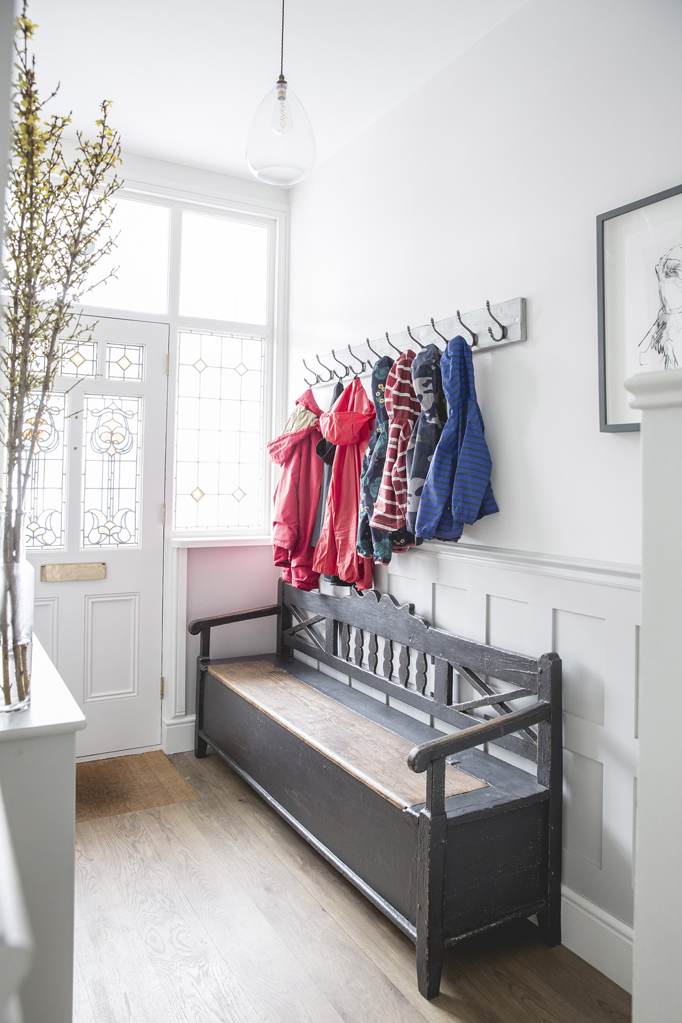
The first focus for our house had to be the hallway. This is the first thing visitors see when they enter the property, and I want their first impression to be ‘this is nice’, not ‘how to I manouvre past the clutter?!” Therefore storage is paramount. We do not have a huge hallway so designing this in from the start is the key. Firstly, think about what you will need to store in the hall and who will be accessing it (do you want the kids hanging their own coats or not?) Then tailor your design around your needs. Be specific. Shoe storage requires different space and access to cold weather accessories. Make use of every inch and try not to waste space with, for example, long dark cupboards that just act like a black hole sucking up mittens.

For this hallway we used a combination of built in and free standing storage solutions. The understairs space was split into two. The taller section becoming a cupboard for the vacuum cleaner and other large items. In the often wasted corner section, a bespoke shoe drawer houses all the family’s shoes. A vintage settle was bought to sit by the front door. This provides both a place to sit whilst putting on and removing shoes, but also additional storage for bags. A 10 hook coat rack was purchased to hang above the settle, again providing ample space to hang all of the family’s coats, plus leaving additional space for visitors!

Don’t ignore your keys and wallets / purses either! Everyone needs somewhere to dump those little things when they walk through the door. Here we decided against a cast iron radiator for the hallway, but stuck to a cheap wall mounted radiator instead. This allowed us to fit a radiator housing which provides the perfect shelf for all those bits and pieces from everyday life.

Colour trends for 2017

admin
acknowledgement - 'Claire Brody Designs'
acknowledgement - 'weheart.co.uk'
acknowledgement - 'plainenglishdesign.co.uk

Reviewing the colour trends for 2017, I was reassured to see that they often reflected my own prediction for greens.

First Pantone’s colour gurus announced that their colour of 2017 is Greenery. In their words – Manifesting as a “fresh and zesty yellow-green shade that evokes the first days of spring”, Greenery envelops the notion to breathe, reinvigorate and appreciate the great outdoors. As well as greenery, expect to see a rise in deep hues such as khaki and olive green. The interiors experts at Elle Deco have declared their fabric of the moment to be emerald velvet. Working alongside these green tones will be brick reds, maroon brown and charcoal grey to recreate a sense of rich and earthy minerals and materials. The green trend is a natural progression from the leafy, jungle look and the idea of bringing the outside in.

Green is a colour I have shyed away from for many years, I think as a result of my mum’s devotion to it in the 70’s! However, taking a fresh look at how it can be used in a modern scheme got me wanting to try it out. My own palette lends itself much more to the richer hues, which can be used for both walls and woodwork, and I have used them a few times lately. Pairing them with greys brings the scheme bang up to date and they sit well with accent colours such as ochre. The photo below shows a kitchen I had painted in a RAL colour similar to Farrow and Ball’s Studio Green. It is a lovely rich green with a hint of blue. Having used blues and greys a few times in kitchens and seen them adorning every kitchen manufacturer’s marketing, I wanted to try something new, and I love the result. Some of the high end manufacturers have started to use green more too. These images from Plain English illustrate how striking it can be. A beautiful modern take on a very traditional colour.

William Morris

admin

I am the first to admit that I have tended to keep pattern to areas where it can be easily updated in the past. A cushion or a duvet cover is not hard to change and can keep a room looking fresh.

Lately though, I’ve been getting increasingly interested in adding a further element of design into my schemes. As current trend moves ever further from minimal interiors, patterned soft furnishings such as rugs and curtains, plus chairs and sofas are all becoming widely available.

Bird and Pomegranate wallpaper. Morris and Co
Brer Rabbit wallpaper. Morris & Co.

In addition to this, patterned wallpaper has also been catching my eye. The feature wall still doesn’t do it for me, but I am liking the idea of wallpapering smaller rooms to create real impact. So where better to start than the smallest room in the house.

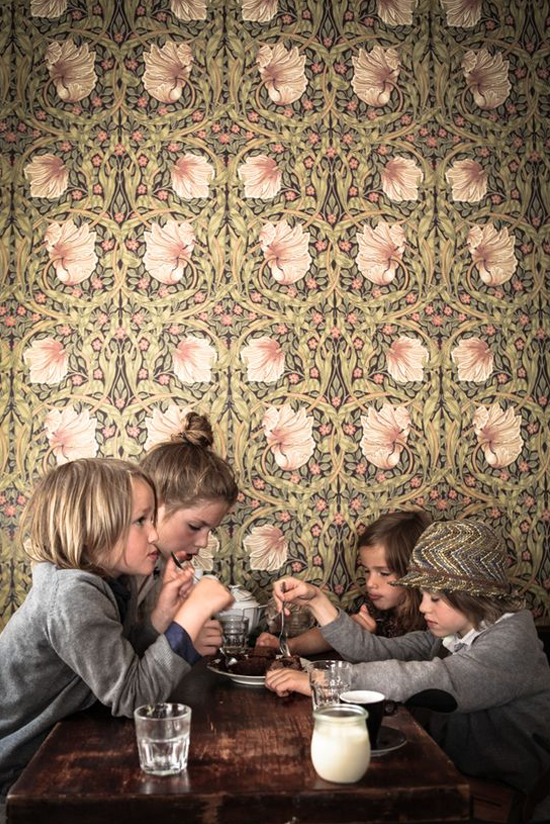
The cloakroom in our latest development will be definitely be adorned with a patterned paper, and as the room is so small it needs to stand up to close inspection. When researching wallpapers certain patterns repeatedly caught my eye and they were invariably by William Morris.

William Morris was an English textile designer, poet, novelist, translator, and socialist activist.

He was one of the most outstanding and influential designers of the Arts and Crafts Movement, and through his company, Morris & Co., he produced some of the most fashionable and exciting textiles and wallpapers of his era.

He started his decorating business in 1861 and today Morris & Co. still produce authentic versions of his original designs alongside new interpretations to create up to date fabrics and wallpapers with timeless appeal.

His patterns are inspired by his intimate knowledge of natural forms, discovered through drawing and stylised through his detailed knowledge of historical styles.

Mokkasin.blogspot.se
Seaweed wallpaper. Morris & Co.

They were usually titled with the names of the flowers that they depicted such as ‘Chrysanthemum’, ‘Jasmine’, ‘Acanthus’, and ‘Sunflower’. In effect, Morris took the natural forms that he found outside in the woods and meadows and used them to decorate the inside of our homes.

This led Morris to say “Have nothing in your house that you do not know to be useful, or believe to be beautiful.” A philosophy we should all bear in mind!

Cutlery

admin

Many moons ago, on a work trip to Sri Lanka, I managed to bring home a full canteen of cutlery in my case.

Not the first thing you’d expect to buy from over there, but it was really unique and so I bought everything, including the bottle opener and carving set! Over the years, multiple pieces have gone walkabouts, leaving us with a rather depleted set.

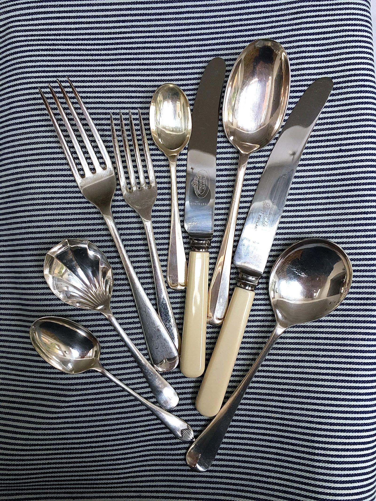
So after a good few months searching around for a replacement I was getting pretty disillusioned at what I had found. Everything seemd to be super contemporary, super dull, super expensive or super naff! Fortunately, I came across the solution at an antiques fair last week with this stylish selection.

The main pieces have a traditional rattail profile. The epitome of enduring style, this design dates back to 1604 when table etiquette was imperative.

Quintessentially English, Rattail is understated and elegant; the embodiment of a modern classic with a subtle raised detail. Unlike most modern interpretations, however, these older pieces have a beautiful weight and a lovely shape and depth to the spoon.

The knives have a bone handle, which is, unfortunately, not dishwasher proof. However, washing a few knives at the end of the day seems a small price to pay. I also found two lovely individual spoons to complement the main pieces – a delicate coffee spoon with intricately detailed handle and a cute fanned dessert spoon which reminds me exactly of one I used as a kid. Who knew desserts could taste even better!!

Connected spaces

admin

When researching the ground floor layout for our latest renovation project I spent a lot of time investigating how most of the houses in the locality had been modernised.

Their layouts broadly fitted into two camps:
1. An open plan ground floor with one large living, dining and kitchen space and a separate WC

2. An open plan rear kitchen diner with a separate and rather cutoff living room at the front and a cloakroom either under the stairs or bisecting the living spaces.

Neither of these layout plans seemed to particularly lend themselves to family life.

dustydeco.com
desiretoinspire.net

Firstly, a fully open plan layout undeniably has wow factor, but in many terraced houses can often feel like one long corridor, plus how do you actually live in it? Where does all the inevitable clobber go that you don’t want on show and how do you escape the noise?

Whilst a separate front sitting room undoubtedly solves the noise problem and allows the possibility of separate activities on one floor, it also creates its own difficulties. Firstly the room is undeniably cutoff from the rest of the floor. Also, the middle of the house often feels dark as light cannot flow through the property.

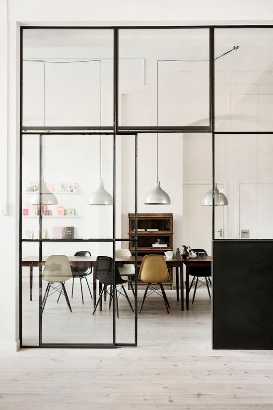
Taking the best parts from both of the above, I have opted for a broken plan layout. This term has been coined for layouts where an open space is loosely divided by partitions, furniture or lighting.

plainenglishdesign.co.uk
stillstars.com

For our development we have taken the intitial layout of a front to back open plan space and inserted a glazed partition incorporating french doors between the sitting room and kitchen. This enables us to close off the two rooms when required but also keep the benefits of open plan – the natural flow through the ground floor plus the transfer of light from the south facing front elevation into the central kitchen area.

Furthermore, we have kept the original kitchen footprint and converted that area into a generous cloakroom and utility room. That way we can ensure there is ample storage space both in the utility and under the stairs, leaving the main spaces free from clutter.

Kensal Rise Project

admin

I’m pleased to say that work has now started on our latest renovation project in Kensal Rise. The house has been split up into bedsits for the last 20 years and is in a sorry state.

The smell of nicotine in one room was so strong that you could last about 2 minutes in there before needing to escape for some fresh air! The landlord was delighted to tell me that the tenant spent most of his spare time holed up in there chain smoking and reading questionable magazines.

Taking the inside back to brick is giving thankfully allowing us to remove the smell (and the memories!).

The renovation will include a full width rear extension and a loft conversion. The house is Edwardian and has great proportions, so it’s exciting so be able to see how the vision will come together.

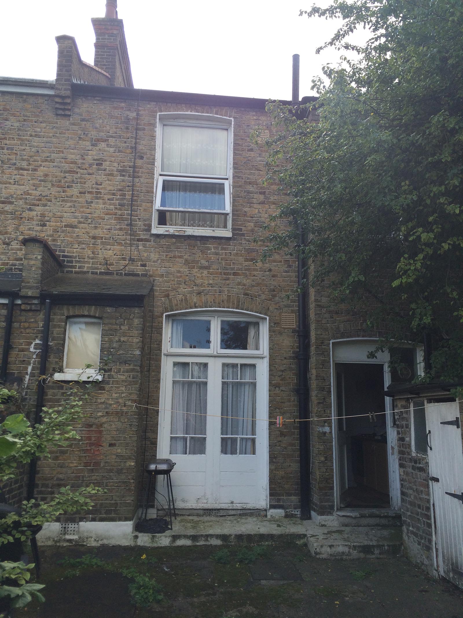
Some pictures here of the ‘before’. I can’t wait to be able to post the ‘after’!

Country House Garden

admin

Has Spring finally arrived? I hope so, but as the sun is never guaranteed here in the UK I took the opportunity to get out into the garden at the weekend. I’m worried my age is catching up with me as I’m actually starting to like gardening!!
It will be some while before I can profess to have green fingers, but the structural and material choices in a garden really do interest me.We developed the garden here two years ago with the objective of a creating a space which was sympathetic to the age of the house but still looked modern.

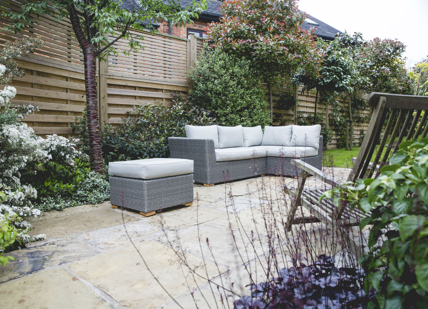
For the main patio areas we chose a reclaimed sandstone.When it was first laid the flags all looked rather grey, but jet washing the stone was a revelation, revealing unique colour and pattern in every slab.

We also managed to find some stones for the steps which were being removed from a local racecourse.The standstone wall was new and rather golden at first, but it is now beginning to age nicely. My favourite piece has to be the brick path. I love the look of old garden cobbled paths and wanted to create something similar.

We laid the bricks in a herringbone pattern and two years in they have weathered beautifully, with moss growing into the joints. For a more modern balance, we opted for a horizontal Hit & Miss fence, with Venetian slatted panels above. They look incredibly smart and always get positive comments from visitors.

1 2